Heatmap#
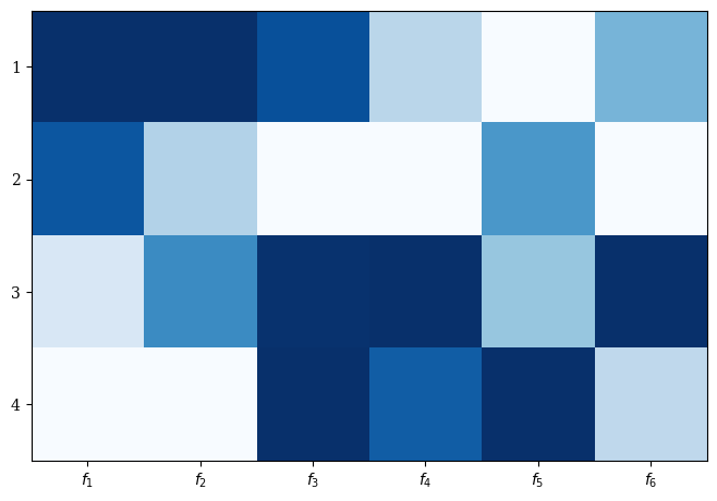
For getting an idea of the distribution of values, heatmaps can be used.
Let us visualize some test data:
[1]:
import numpy as np

np.random.seed(1234)
F = np.random.random((4, 6))
A simple heatmap can be created by:
[2]:
from pymoo.visualization.heatmap import Heatmap
Heatmap().add(F).show()
[2]:
<pymoo.visualization.heatmap.Heatmap at 0x72db381ed450>
[3]:
Heatmap(bounds=[0,1]).add(np.ones((1, 6))).show()
[3]:
<pymoo.visualization.heatmap.Heatmap at 0x72db380c4e50>
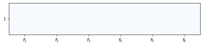
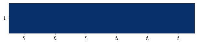
This behavior can be changed by setting reverse to False.
[4]:
Heatmap(bounds=[0,1],reverse=False).add(np.ones((1, 6))).show()
[4]:
<pymoo.visualization.heatmap.Heatmap at 0x72db35bdb550>
The plot can be further customized by supplying a title, labels, and by using the plotting directives from matplotlib. Also, colors can be changed:
[5]:
plot = Heatmap(title=("Optimization", {'pad': 15}),
               cmap="Oranges_r",
               solution_labels=["Solution A", "Solution B", "Solution C", "Solution D"],
               labels=["profit", "cost", "sustainability", "environment", "satisfaction", "time"])
plot.add(F)
plot.show()
[5]:
<pymoo.visualization.heatmap.Heatmap at 0x72db35a643d0>
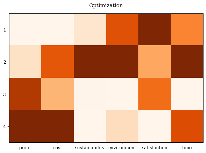
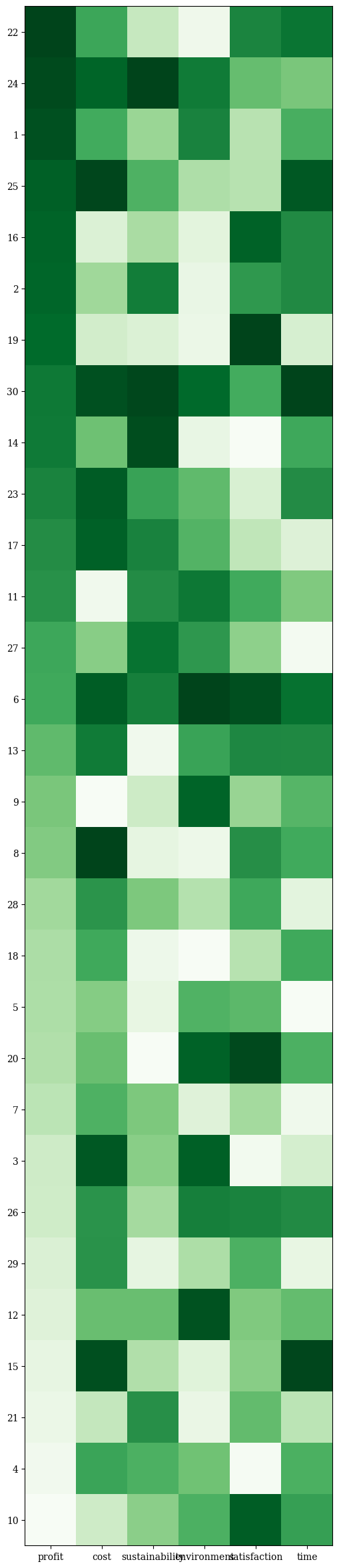
Moreover, the values can be sorted lexicographically by objective(s) - and by default, the selected objective is inserted in position 0 of the range of objectives. Also, boundaries can be changed. Otherwise, it is scaled according to the smallest and largest values supplied.
[6]:
F = np.random.random((30, 6))

plot = Heatmap(figsize=(10,30),
               bounds=[0,1],
               order_by_objectives=0,
               solution_labels=None,
               labels=["profit", "cost", "sustainability", "environment", "satisfaction", "time"],
               cmap="Greens_r")

plot.add(F, aspect=0.2)
plot.show()
[6]:
<pymoo.visualization.heatmap.Heatmap at 0x72db35b29990>
API#
- class pymoo.visualization.heatmap.Heatmap(cmap='Blues', order_by_objectives=False, reverse=True, solution_labels=True, **kwargs)[source]
Initialize Heatmap.
- Parameters:
cmap – The color map to be used.
order_by_objectives – Whether the result should be ordered by an objective. If False no order. Otherwise, either supply just the objective or a list (it is lexicographically sorted).
reverse – If True large values are white and small values the corresponding color. Otherwise, the other way around.
solution_labels – If False no labels are plotted in the y axis. If True just the corresponding index. Otherwise, the label provided.
**kwargs – Additional keyword arguments passed to parent Plot class.