
Parallel Coordinate Plots#
For higher-dimensional data, Parallel Coordinate Plots are a powerful technique to analyze how dense solutions are distributed in different ranges regarding each coordinate.
Let us create some data for visualization:
[1]:
from pymoo.problems.many.dtlz import DTLZ1
from pymoo.util.reference_direction import UniformReferenceDirectionFactory

ref_dirs = UniformReferenceDirectionFactory(6, n_partitions=5)() * [2, 4, 8, 16, 32, 64]
F = DTLZ1().pareto_front(ref_dirs)
This is the Pareto-front for the DTLZ1 test problem with six objectives, with some scale added. We add a different scaling to show the effect of normalization later on. Let us assume our algorithm converged after some generations, and this is the result set.
[2]:
from pymoo.visualization.pcp import PCP
PCP().add(F).show()
[2]:
<pymoo.visualization.pcp.PCP at 0x7258db45d8d0>
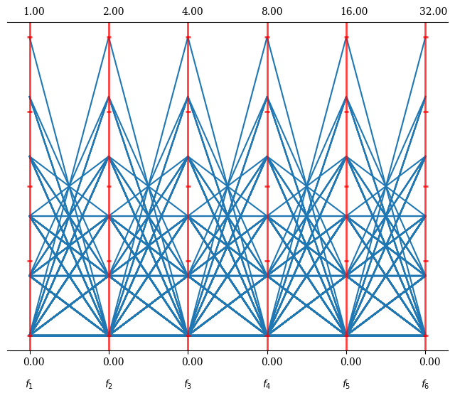
This gives an idea of the overall result set. Let us assume we identified solution 50 and 75 to be more of interest and would like to highlight them in our plot:
[3]:
plot = PCP()
plot.set_axis_style(color="grey", alpha=0.5)
plot.add(F, color="grey", alpha=0.3)
plot.add(F[50], linewidth=5, color="red")
plot.add(F[75], linewidth=5, color="blue")
plot.show()
[3]:
<pymoo.visualization.pcp.PCP at 0x7258d8818210>
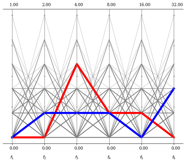
Please note that the PCP object just is a wrapper around a matplotlib figure. All options that apply for plotting the corresponding type (here plot, but it can also be scatter, polygon, …) can be used, such as linewidth, color or alpha.
Some more options to be used in a plot
[4]:
plot = PCP(title=("Run", {'pad': 30}),
           n_ticks=10,
           legend=(True, {'loc': "upper left"}),
           labels=["profit", "cost", "sustainability", "environment", "satisfaction", "time"]
           )

plot.set_axis_style(color="grey", alpha=1)
plot.add(F, color="grey", alpha=0.3)
plot.add(F[50], linewidth=5, color="red", label="Solution A")
plot.add(F[75], linewidth=5, color="blue", label="Solution B")
plot.show()
[4]:
<pymoo.visualization.pcp.PCP at 0x7258dabd1750>
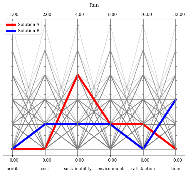
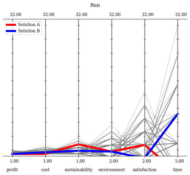
Moreover, if the boundaries should be set manually, this can be achieved by turning the default normalization off and providing them. Either directly as a NumPy array or just an integer to be set for all axes.
[5]:
plot.reset()
plot.normalize_each_axis = False
plot.bounds = [[1,1,1,2,2,5],[32,32,32,32,32,32]]
plot.show()
[5]:
<pymoo.visualization.pcp.PCP at 0x7258dabd1750>
<Figure size 800x600 with 0 Axes>
API#
- class pymoo.visualization.pcp.PCP(bounds=None, show_bounds=True, n_ticks=5, normalize_each_axis=True, bbox=False, **kwargs)[source]
Initialize PCP.
- Parameters:
bounds – Bounds for normalization.
show_bounds – Whether the value of the boundaries are shown in the plot.
n_ticks – Number of ticks to be shown on each parallel axis.
normalize_each_axis – Whether the values should be normalized either by bounds or implicitly.
bbox – Whether to use bounding boxes for labels.
**kwargs – Additional keyword arguments passed to parent Plot class.